
UX Certification
Get hands-on practice in all the key areas of UX and prepare for the BCS Foundation Certificate.

Most companies would claim to design products and services that are simple to use. But when you ask customers to actually use these products and services, they often find them far from simple. Why is there a disconnect between what organisations think of as "simple" and what users actually experience?
It's fashionable to blame poor usability on firms not doing enough customer research. On the face of it, this seems like the obvious cause of poor usability. If firms only did the research, they would realise their product was a dud. But, like all obvious reasons, it's wrong.
In reality, there's never been a better time to be a purveyor of customer research tools. Every organisation seems to want to "take the temperature" of their customers. Take a quick look in your junk folder at the number of times you've been asked to complete a survey over the last month. If it's like mine, it will number in the double digits.
The problem isn't with the quantity of user research. It's with the quality.
Organisations struggle to distinguish good user research from bad user research.
Here are 7 examples of poor user research practice that I've come across in my work with clients — along with some ideas on how to fix them.
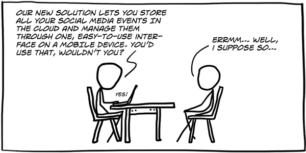
The dictionary defines credulity as a state of willingness to believe something without proper proof. The form this takes in user research is asking users what they want (and believing the answer).
A couple of months ago I was attending a usability study on behalf of a client. I'm there because the client thinks that the usability tests they are running aren't delivering much predictive value. The client was concerned they weren't recruiting the right kind of people or maybe the analysis wasn't right.
As I sat in the observation room, I watched the administrator show three alternative designs of a user interface to the participant and ask: "Which of these three do you prefer? Why?"
Asking people what they want is very tempting. It has obvious face validity. It seems to make sense.
But it's also wrong.
Here's why. Nearly 40 years ago, psychologists Richard Nisbett and Timothy Wilson carried out some research outside a bargain store in Ann Arbor, Michigan.
The researchers set up a table outside the store with a sign that read, “Consumer Evaluation Survey — Which is the best quality?" On the table were four pairs of ladies' stockings, labelled A, B, C and D from left to right.
Most people (40%) preferred D, and fewest people (12%) preferred A.
On the face of it, this is just like the usability test I observed.
But there's a twist. All the pairs of stockings were identical. The reason most people preferred D was simply a position effect: the researchers knew that people show a marked preference for items on the right side of a display.
But when the researchers asked people why they preferred the stockings that they chose, no-one pointed to the position effect. People said their chosen pair had a superior denier, or more sheerness or elasticity. The researchers even asked people if they may have been influenced by the order of the items, but of course people looked at the researchers like they were crazy. Instead, people confabulated: they made up plausible reasons for their choice.
There's an invisible thread joining the study by Nisbett and Wilson and the usability test I observed. The reason I call the thread 'invisible' is because few user researchers seem to be aware of it — despite the fact that there's a whole sub-discipline of psychology called Prospect Theory devoted to it — and that Daniel Kahneman won a Nobel prize for exploring the effect.
People don't have reliable insight into their mental processes, so there is no point asking them what they want.
In practice, this means it's a bit like Fight Club: the first rule of finding out what people want is: don't ask people what they want.
I think this quotation from Rob Fitzpatrick (author of The Mom Test) captures it perfectly:
Trying to learn from customer conversations is like excavating a delicate archaeological site. The truth is down there somewhere, but it's fragile. While each blow with your shovel gets you closer to the truth, you're liable to smash it into a million little pieces if you use too blunt an instrument.
How can we overcome this problem?
My definition of a successful user research study is one that give us actionable and testable insights into users' needs. It's no good asking people what they like or dislike, asking them to predict what they would do in the future, or asking them to tell us what other people might do.
The best way of gaining actionable and testable insights is not to ask, but to observe. Your aim is to observe for long enough so that you can make a decent guess about what's going on. Asking direct questions will encourage confabulation, not tell you what is actually going on.
There are two ways to observe. We can observe how people solve the problem now. Or we can teleport people to the future and get them using our solution (a prototype) to see where the issues will arise.
The key point is: What people say is not as useful as what people do, because people are unreliable witnesses.
Dogmatism is the tendency to lay down principles as undeniably true, without consideration of evidence or the opinions of others. The form this takes in user research is believing there is one 'right' way to do research.
I'm sure we've all worked with people who think that a survey is "the right way" to understand user needs. Perhaps because we hear about surveys every day in the news, people tend to think of them as being more reliable or useful. The notion of using an alternative method, like a site visit or a customer interview, doesn't have the same face validity because the sample size is comparatively small.
But sadly, having a large number of respondents in a survey will never help you if you don't know the right questions to ask. That's where site visits and customer interviews come in.
Site visits and customer interviews are a great way to get insights into your users needs, goals and behaviours. But these aren't the only solution either.
Recently I worked with a user researcher who seemed to think there was no room for any research method other than customer interviews. To validate personas: run more customer interviews. To identify your top tasks: run more customer interviews. To compare two alternative landing pages: run more customer interviews.
This kind of dogmatism is unhelpful.
Site visits and customer interviews give you signposts, not definitive answers. It's broad brush stuff, a bit like the weather forecast. There may be some patterns in the data, but these aren't as useful as the conversation you have with users and the things you observe them do. It's those conversations that help you identify the gap between what people say and what they do — and that is often a design opportunity.
But there comes a point when you need to validate your findings from site visits and customer interviews by triangulation: the combination of methodologies in the study of the same phenomenon.
Quantitative data tells us what people are doing. Qualitative data tells us why people are doing it. The best kind of research combines the two kinds of data.
For example, you might choose a survey to validate personas you've developed through site visits. Or you might choose multivariate A/B testing to fine tune a landing page that you've developed by usability testing.
Triangulation is like having different camera angles in a movie. It would be hard to understand the full picture of what is going on in a movie if every frame was shot as a close-up. Similarly, it would be difficult to understand the story if every image was shot as a wide angle view. Like movies, you want your research to show the close-ups but you also want to see the bigger picture.
Bias means a special influence that sways one's thinking, especially in a way considered to be unfair.
User research is a continual fight against bias. There are a handful of different kinds of bias that matter in user research, but it's response bias I want to discuss here. This is caused by the way in which you collect data.
Sometimes the bias is obvious. For example, if you ask poor questions you're likely to get participants to tell you what you want to hear. You can correct this bias by teaching people to ask the right questions. But there's an even more pernicious type of response bias that's much harder to correct.
This happens when the design team carry out the research and find that people don't really have a need for the product or service. It's tempting to hide this from senior managers because no-one wants to be the purveyor of bad news.
But if there's no need for your product, there's no point trying to convince senior managers that there is — you'll be found out in the end. It's a bad idea to cherry pick the results to support what a senior person wants to hear.
You shouldn't approach interviews with a vested interest: the user researcher's job isn't to convince people to use a service, or to get the results management want; it's about digging for the truth.
This doesn't mean you shouldn't have a point of view. You should. Your point of view should be to help the design team understand the data, not just tell the design team what they want to hear.
Obscurantism is the practice of deliberately preventing the full details of something from becoming known. The form this sin takes in user research is keeping the findings in the head of one person.
User research is often assigned to a single person on a team. That person becomes the spokesperson for user needs, the team's expert on users.
This approach is a poor way to do research, and not just because the user researcher doesn't know all the answers. The reason it fails is because it encourages the design team to delegate all responsibility for understanding users to one person.
Caroline Jarrett has captured it well in this tweet.
User researcher's fallacy: "My job is to learn about users". Truth: "My job is to help my team learn about users". #ux
— Caroline Jarrett (@cjforms)
July 4, 2014
This means user researchers are facilitators as much as researchers.
One way you can prevent this sin on your own project is to encourage everyone on the team to get their "exposure hours". Jared Spool has introduced us to this notion. His research shows that the most effective design teams spend at least two hours every six weeks observing users (for example, in field visits or usability tests).
What you're aiming for here is building a user centred culture. You do that by encouraging the whole design team to engage with users. But you also need to design iteratively. And that takes me to my next sin.
Laziness is the state of being unwilling to exert oneself. The form this takes in user research is in recycling old research data as if it's boilerplate that can be cut and pasted into a new project.
My favourite example of this comes from the world of personas.
I find that clients often approach the process of developing personas as a one-time activity. They will hire an outside firm to do field research with the requisite number of users. That firm will analyse the data and create a set of beautifully presented personas. Now we already know this is a bad idea because of the sin of Obscurantism. We want the design team doing the research, not an external firm.
But let's ignore that issue for a moment. The reason I'm using personas as an example here is because I'm often asked by a client if they can re-use their personas. They are now working on a new project, which has a passing resemblance to one on which they developed personas last year. Since their customers are basically the same, isn't it OK to recycle the existing personas?
This idea so misses the point of what user research is about that it serves as a good example.
Here's a secret many people don't know: you don't need to create personas to be user centred. User centred design is not about personas. In fact, personas really don't matter. Creating personas should never be your goal — understanding users' needs, goals and motivations should be your goal. In some ways, a set of beautifully formatted personas is just proof that you met with users, in the same way that a selfie with a celebrity proves you were at the same restaurant.
The world you want to move to is one where the design team knows its users so well that personas aren't needed. You don't get to this world by recycling old research. You do it by making user research part of the culture.
We've known for a long time now that you achieve user centred design by iteration: you build something, you measure its usability, you learn from it and you redesign. Re-using old data, whether it's in the form of personas, usability tests or field visits, is not iterating — and it's certainly not learning.
Vagueness means not clearly or explicitly stated or expressed. In terms of user research, I see it when a team fails to focus on a single key research question and instead tries to answer several questions at once.
This sin is partly caused by the sin of laziness. If you do research only occasionally, you need to answer lots of questions. This means you end up learning a little about a lot. In fact, you can learn an important lesson about user research from a dishwasher. If you cram a lot in, nothing gets very clean.
With user research, you actually want to learn a lot about a little. That "little" question is the specific question that's keeping you up at night. To uncover this question, I ask the design team to imagine the most useful, actionable research results possible. What would they tell us? How would we use them?
Everyone on the team should agree on the questions you plan to answer and the assumptions you plan to test. These top questions should be the drivers of every research activity.
This means you need to get specific with your research questions: you should be able to articulate your research questions on a couple of small sticky notes.
In fact, that leads me to an interesting exercise you can do to discover your focus question.
Sit the design team in a room. Give each person a set of sticky notes. Tell them to imagine that we have an all-knowing, insightful user outside the room who will answer truthfully any question we throw at them.
What questions would you ask?
I get the team to write one question per sticky note. After 5 minutes, we work as a team to affinity sort the sticky notes. Then we dot-vote on the group of questions that are most urgent to answer. This idea works well because we not only identify the high-level theme but we also have a list of the specific questions to which we need to get answers.
Last but not least we have Hubris. Hubris means extreme pride or self-confidence.
In user research, it takes the form of taking undue pride in your reports. All user researchers suffer from this to some extent, but those with PhDs are the worst. And I say that as someone with a PhD.
User researchers love data. And when you love something, you want to share it with people. So you create detailed reports packed with graphs and quotations and screenshots and callouts. Look at my data! Look at how beautiful it is!
Sadly, few other people are as fascinated by data as we are. Our challenge is to turn that data into information, and turn that information into insight.
There are two problems with excessive detail.
Instead, you need to create information radiators (like usability dashboards and 1-page test plans) to get teams understanding the data so they can take action on it. Information radiators are essentially advertising billboards that gradually permeate the team's awareness of your results. As a general rule, if people need to turn the page, your report is too long. So ask yourself: how can we capture the results in a single glance?
This could be a concise visual way of presenting research data, like a user journey map, a persona, or a usability testing results dashboard.
As I've reviewed these sins, you may have noticed that many of them appear to have a common cause: the root cause is an organisational culture that can't distinguish good user research from bad user research.
Companies say they they value great design. But they assume that to do great design they need a rock star designer.
But great design doesn't live inside designers. It lives inside your users' heads. You get inside your users heads by doing good user research: research that provides actionable and testable insights into users' needs.
Great design is a symptom. It's a symptom of a culture that values user centred design.
And bad design is a symptom too. It's a symptom of an organisation that can't distinguish good user research from bad user research.
And perhaps that's the deadliest sin of them all.

Dr. David Travis (@userfocus) has been carrying out ethnographic field research and running product usability tests since 1989. He has published three books on user experience including Think Like a UX Researcher. If you like his articles, you might enjoy his free online user experience course.

Gain hands-on practice in all the key areas of UX while you prepare for the BCS Foundation Certificate in User Experience. More details

This article is tagged ethnography, focus groups, moderating, personas, usability testing.
Our most recent videos
Our most recent articles
Let us help you create great customer experiences.
We run regular training courses in usability and UX.
Join our community of UX professionals who get their user experience training from Userfocus. See our curriculum.
copyright © Userfocus 2021.
Dr. David Travis (@userfocus) has been carrying out ethnographic field research and running product usability tests since 1989. He has published three books on user experience including Think Like a UX Researcher.
Get hands-on practice in all the key areas of UX and prepare for the BCS Foundation Certificate.
We can tailor our user research and design courses to address the specific issues facing your development team.
Users don't always know what they want and their opinions can be unreliable — so we help you get behind your users' behaviour.