There are three key design components to any survey. Going from the general to the specific these are:
- The overall content of the survey
- The phrasing of individual questions
- The rating scale
How to design the content of the survey
- Begin with the end in mind. Think about what you are going to do with the answers and how are you going to analyse the survey. For example, asking your customers to reveal their income is an easy question to ask but what will
you do with the answer?
- Route people around questions they don't need to answer. Most web survey tools include “skip logic”, so if a respondent says they are “not currently in employment” you can jump over all the demographic
questions about their job.
- Save demographic questions until the end. Respondents will have a certain amount of goodwill towards your survey and you don't want to use up this goodwill with simple questions about their age and gender. So engage respondents
by asking the interesting questions early in the survey. Keep the more boring demographic questions until the end.
- Give people a space at the end of the survey to write about other important information that is relevant. Some people feel constrained by having to always tick boxes.
- Get someone to proof read the survey before you publish it and then pilot test it on some people who might have to fill it in.
How to phrase individual questions
- Use neutral wording when introducing questions and avoid leading questions. If somebody can accuse you of having hinted to the respondent that you want them to answer in a particular way (usually positively) there may be something
wrong with the way you phrased the question. For example, use expressions such as “What is your opinion of...?”, “How do you feel about the...?”, “To what extent, if at all, do you...?”, “How good
or poor...?”, “How important or unimportant...?”, but NOT, “How good...?”, “How important...?”
- Make the questions as simple as possible. Ask the question in the way it might normally be asked if it was a spoken question (e.g. in plain English) and avoid double negatives (e.g. “not unfair”).
- Avoid too many open questions. Closed questions (with a range of boxes to tick) are much easier to analyse than open questions (giving people space in which they write about something). don't ask for written information unless
you're prepared to spend the time analysing it properly, otherwise it's a waste of the respondent's time asking for it. Remember that most respondents prefer not being asked to write lots of detail (unless it's about something they feel
really strongly).
- Ask general questions before specific questions. If you're going to ask a general question about something (such as overall satisfaction with your web site), ask the general question first before you ask about specific things
(such as satisfaction with the monthly newsletter or the visual design of the home page). This is because if the respondent feels very strongly about the last item on the list of specifics it might have too great an influence on their response
to the general question if that were to follow rather than precede.
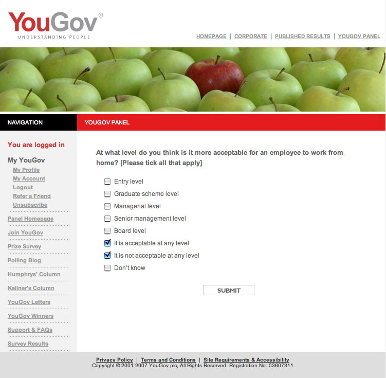
- Use radio buttons and check boxes appropriately. For example, if respondents should pick just one option from a list, use radio buttons. Use checkboxes only when multiple choices are allowed. If you think this is obvious,
see a real-world example of this blooper from an organisation that should know better.
- Be careful if asking follow-up “why” questions. Occasionally you will want to know “why” a respondent has answered a question in a particular way, for example why they haven't bought from your site
in the last six months. Although this type of question can give valuable information you need to be aware of how this question can also easily give you false or misleading information. A common blooper is to only ask “why” when
someone responds negatively. If the respondent sees that they will have to explain their answer if they say no, then the respondent may be tempted to say “yes” for the wrong reason.
How to design the rating scales
- Use scales with equal options for positive and negative replies. 4-point scales should have two positive and two negative options such as “good”, “fairly good”, “fairly poor” and “poor”.
5-point scales should have two positive and two negative options with a neutral middle choice.
- Use scales whose end points are equally positive and negative. For example, scales going from “very good” to “very poor” or from “good” to “poor”, but not from “very good”
to “poor”.
- Use scales that measure only one thing at a time. For example, five-point scales that go from “very good” to “very poor” should have a neutral mid-point such as “neither good nor poor” that
talks about quality, but NOT have “average” or “satisfactory” as their middle point. “Average” belongs in its own scale of “above average” to “below average”. Similarly, “satisfactory”
belongs in its own scale of “more than satisfactory” to “less than satisfactory”.
- Be aware of people's natural tendency to avoid ticking end boxes. People tend to go for the middle boxes. You can make this tendency even more pronounced by labelling your end points “very” or “extremely”
or “always”. Some researchers like using an even number of boxes in a scale, to make sure that people have to come down off the fence and opt for either “fairly good” or “fairly poor”.
- Plan ahead. Think when you design the questionnaire whether you want to compare results to two questions and choose the same scale for both questions if you do. Compare like scales with like, for example a scale whose ends
are “strongly agree / strongly disagree” with another one whose ends are “strongly agree / strongly disagree” and NOT with one whose ends are “agree / disagree” or “very good / very poor”.
- Points on a scale should be clearly different. Avoid having two points on a scale that are very similar in meaning for people, such as “quite good” and “fairly good”.
- Give people a “does not apply” or “N/A” option if this is appropriate. Otherwise you could falsely inflate the percentage of respondents ticking a particular response option.
- Be careful when giving people a “don't know” option. There will be occasions when respondents genuinely don't know the answer to a particular question and they should be given the opportunity to say so, but some
respondents will be tempted to use a “don't know” box as a soft option especially when it helps them avoid having to think about the question. So try to make the wording stronger, such as “no idea at all” to try to
reduce the number of respondents tempted to choose the easy option. In particular, never use “don't know” as the middle box on a scale, but put it at the end of the options.
- Use mutually exclusive categories for age, time, length of use etc. For example, “16-24” should be followed by “25-30” and not “24-30”.
Bonus tips: How to improve your response rate
- Write a short covering email that gives details of why you want the information and what will be done with the results. If people understand the purpose behind the survey and see the value of it, they will be much more motivated
to complete it. If possible, make it clear to potential respondents how the information will be used to benefit them. Your covering email should also say the date when you need the survey completed and tell people how long the survey will
take to complete.
- Keep the survey as short as possible. Try to resist the strong temptation to find out everything there is to know about the subject and only ask things that you have a chance of doing something about. Ensure your questions
are unique and there's no overlap in what you're asking.
- Add an incentive. Offering to enter respondents into a prize draw for a desirable gift (like an iPod) can have a dramatic impact on your response rate.
- Send out a reminder if replies are slow in coming back.
