
UX Certification
Get hands-on practice in all the key areas of UX and prepare for the BCS Foundation Certificate.

The Design Studio is a wonderful methodology to encourage multidisciplinary design, but in practice teams often create design concepts that aren’t grounded in user research. We can bake user research findings into every design concept that emerges by using the context of use (users, goals and environments) as a constraint. As an added bonus, this approach helps teams create many more solutions to a design problem.
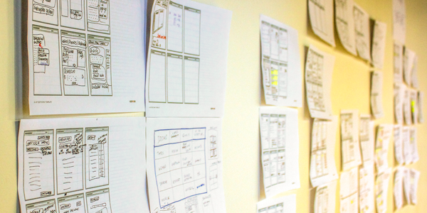
A Design Studio is an intense ideation session used by development teams to generate a range of potential design solutions to a problem. By bringing together a multidisciplinary team, a Design Studio ensures that all voices and disciplines are heard in the design process instead of relegating design to a single, genius designer.
If you participated in a well-run Design Studio, you would first hear a summary of the user research that had been done up to that point and arrive at a shared understanding of the user needs and the business constraints. Next, you would work alone or with a partner to sketch potential design solutions as many as possible. (The focus is on quantity rather than quality). After 30 minutes or so, you place your designs on the wall and present them to the group for critique, describing how each of your sketches solves the design problem. Once all the designs have been presented, the sketching process repeats with teams iterating on the most promising ideas.
That’s the theory, anyway.
Having observed more than a few Agile teams take part in Design Studios, my overriding impression is that most of the resulting designs pay lip service at best to user research.
In some cases, this is because the team members simply ignore the research. This sometimes stems from the fact that, in the past, team members have experienced the sloppy, non-actionable, marketing kind of research that isn't helpful for design, so they mentally switch off during the research briefing and roll their eyes.
And in other cases, I suspect teams get caught up in the frenetic atmosphere of a Design Studio, feel under pressure to create many design ideas quickly and simply forget to ground their designs in research.
Whatever the cause, I've seen participants frequently fall back on stale ideas that have been rejected in the past, submit design concepts based on invalidated assumptions, and create sketches that reflect design concepts that they personally like. The end result is that in a poorly run Design Studio, even one where the personas have been proudly stuck to the walls, teams can very quickly end up designing for themselves.
The end result is the same: the user research ends up making a minor contribution to the design ideas.
I decided to change things up in a recent Design Studio that I facilitated. This time, I wanted to ensure that user research was baked into every design idea by presenting the research as a constraint.
It’s tempting to believe that to come up with creative ideas, we should ignore all constraints. Ignore what’s possible! Imagine you had infinite time and money! We can do anything! However, that belief is wrong: creativity is helped, not hindered, by constraints. For example, when asked to design a house with no constraints, architect Frank Gehry said:
'I had a horrible time with it. I had to look in the mirror a lot. Who am I? Why am I doing this? What is this all about? It’s better to have some problem to work on. I think we turn those constraints into action.'
The most important constraint in user experience is the context of use: the user, the user’s tasks and the environment where the action takes place. To this, we could add other constraints to encourage our thinking, such as the emotional intent, a UI design pattern, a UX design principle, a usability objective or a behavioural nudge. But by ensuring that every design idea is grounded in the context of use, we can be sure that research is at the heart of every design idea.
To make this work in practice, I used a creativity booster from Michael Michalko’s creativity book, ThinkerToys. The idea is called ‘Selection Box’. Here’s how to include this in your own Design Studio.
Find a whiteboard. If you can’t find a whiteboard, find a wall. If you can’t find a wall, make one. If you need to, take some flipchart paper and attach it to the wall.
Draw 5 columns on the whiteboard and label the first three columns ‘User’, ‘Environment’ and ‘Goal’. Then decide on a couple of other constraints for the other two columns. In the example shown here, I’ve added ‘Design pattern’ and ‘Emotional intent’.
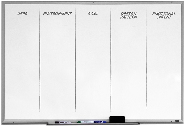
Figure 1: A whiteboard is divided into five columns labelled ‘User’, ‘Environment’, ’Goal’, ’Design pattern’ and ‘Emotional intent’.
Place 5 sticky notes in each column. This will form the skeleton of your selection box.
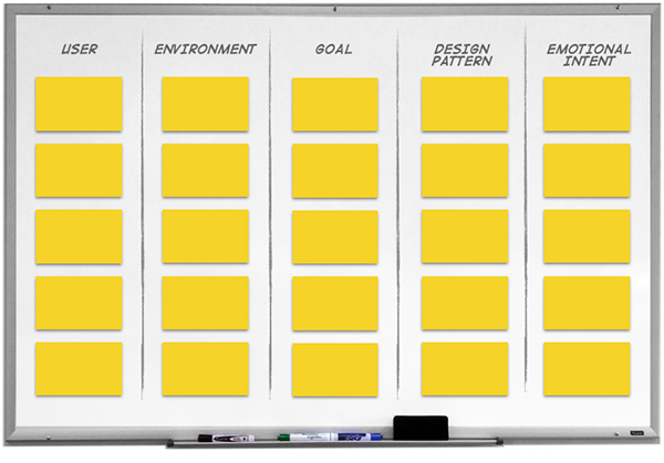
Figure 2: The whiteboard contains a grid of 25 blank sticky notes, with 5 notes in each column.
In this step, you list five specific examples of each constraint. For example, for ‘User’ you would probably list your personas. In the example shown in Figure 3, I’ve used examples of user types, such as ‘Tech novice’, ‘Intermediate’, etc. For ‘Environment’, you would list the relevant aspects of the users’ environments that you have seen in your user research, such as ‘Office / Desktop’ or ‘Commuter / Phone’. For ‘Goals’ you would list the various red routes or user needs. The example in the image shows the way this might look for an online banking service.
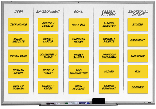
Figure 3: Each of the sticky notes in each column now has written on it an example of each constraint.
Each person or team taking part in the Design Studio now creates a set of 5 constraints by choosing one example from each column. In the example shown in Figure 4, the designer has selected a novice user using the service on a phone while commuting, who wants to transfer money. The design pattern will be a wizard and the emotional intent is to make the user confident. Taking these constraints, the designer now quickly sketches a potential design solution.
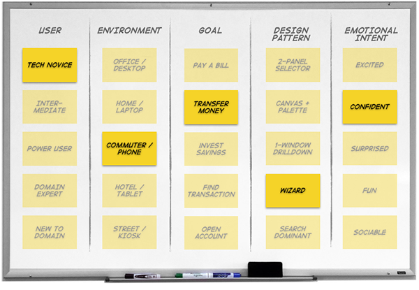
Figure 4: One sticky note in each column is highlighted. In this example, the highlighted sticky notes are ‘Tech novice’, ‘Commuter / Phone’, ‘Transfer money’, ‘Wizard’ and ‘Confident’.
If I’ve done my maths right, there are 5 x 5 x 5 x 5 x 5 possible combinations, which results in 3,125 possible design ideas from this matrix. That's more than halfway to the 5,127 failed prototypes that James Dyson created when developing his bagless vacuum cleaner! (The difference is that it took Dyson 5 years. You can do this in an afternoon).
To generate more ideas, take each of the selected constraints and ‘turn it up to 11’ (with apologies to Spinal Tap). For example, to turn a persona up to 11, take one of the persona’s important characteristics and magnify it. In the example shown in Figure 5, a ‘tech novice’ becomes someone who has never even used an ATM.
Then take each item and reverse your assumption. For example, instead of a wizard design pattern, how would we design a system that showed all of the options?
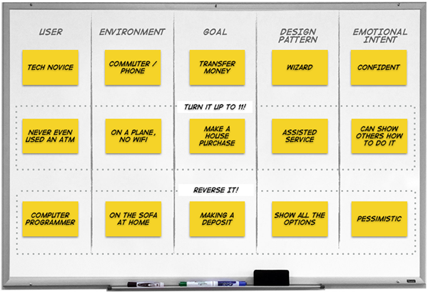
Figure 5: Each of the selected constraints shown in Figure 4 has been ‘turned up to 11’ and ‘reversed’ to create yet more design ideas.
If you need yet more ideas, return to Step 3 and replace the two end columns with alternative constraints. Here's some that I've found useful:
It’s wise to keep the first three columns focussed on the context of use since that’s how you’ll bake your research findings into every design concept. I've also found it works best when I have 4-5 constraints in total: fewer than that fails to tell a story and more than that makes it a little too complex.
The approach has at least two benefits.
I hope you get the chance to try this technique in your next Design Studio. Let me know how it went in the comments.
If you'd like us to facilitate a design studio with your team, get in touch. And if you'd like to hear more ideas like this, register your interest in our new 1-day workshop, Sketching and ideation for designers who can’t draw.

Dr. David Travis (@userfocus) has been carrying out ethnographic field research and running product usability tests since 1989. He has published three books on user experience including Think Like a UX Researcher. If you like his articles, you might enjoy his free online user experience course.

Gain hands-on practice in all the key areas of UX while you prepare for the BCS Foundation Certificate in User Experience. More details

This article is tagged iterative design.
Our most recent videos
Our most recent articles
Let us help you create great customer experiences.
We run regular training courses in usability and UX.
Join our community of UX professionals who get their user experience training from Userfocus. See our curriculum.
copyright © Userfocus 2021.
Dr. David Travis (@userfocus) has been carrying out ethnographic field research and running product usability tests since 1989. He has published three books on user experience including Think Like a UX Researcher.
Get hands-on practice in all the key areas of UX and prepare for the BCS Foundation Certificate.
We can tailor our user research and design courses to address the specific issues facing your development team.
Users don't always know what they want and their opinions can be unreliable — so we help you get behind your users' behaviour.