
UX Certification
Get hands-on practice in all the key areas of UX and prepare for the BCS Foundation Certificate.

Although the cognitive walkthrough gets less coverage than Nielsen’s heuristic evaluation, it’s just as effective at uncovering interaction problems. It’s also an ideal way to identify problems that users will have when they first use an interface, without training.
The cognitive walkthrough is a formalised way of imagining people’s thoughts and actions when they use an interface for the first time. Walkthroughs identify problems that new users will have when they first use an interface. You select one of the tasks that the design is intended to support and then you step through the task, action by action, seeing if you can identify any problems with the interface.
Although the technique was developed over 20 years ago (by Cathleen Wharton, John Rieman, Clayton Lewis and Peter Polson) it is much less widely used than heuristic-based expert reviews. This is a shame because the technique simulates the way real people use an interface: by exploration rather than by reading the manual.
Before you can start a cognitive walkthrough, you need a complete, written list of the actions needed to complete the task with the interface — the ‘happy path’. For example, here’s the happy path for creating a customised voicemail message on an iPhone:
Sometimes, creating the happy path is all you need to do to realise there is a problem with the interface. For example, configuring email on a Nokia 6233 requires 78 separate steps. If your happy path has this many actions, there's no need to continue with the review: you've found a serious problem already.
Once you have the happy path, you’re ready to start the walkthrough.
The cognitive walkthrough is structured around 4 questions that you ask of every step in the task. You ask these questions before, during and after each step in the happy path. If you find a problem, you make a note and then move on to the next step of the task.
This question finds problems with interfaces that make unrealistic assumptions about the level of knowledge or experience that users have. It also finds problems with systems where users expect to do a different action because of their experience with other interfaces or with life generally.
For example, my Sony Vaio laptop has two settings, ‘Stamina’ and ‘Speed’ (see Figure 1). The designers assume that I will switch to the ‘Stamina’ setting to save battery power and use the ‘Speed’ setting for graphics-intensive applications, such as games. Is this assumption reasonable?

Figure 1: Stamina or speed?
This question identifies problems with hidden controls, like the gestural user interfaces required by an iPad where it's not always obvious what you can do. It also highlights issues with context-sensitive menus or controls buried too deep within a navigation system. If the control for the action is non-standard or unintuitive then it will identify those as well.
The world of TV remote controls provides a familiar example. Remote controls often contain a flap to hide features that are rarely used (see Figure 2). The problem occurs when you need access to those functions but, because you rarely use them, you don’t realise you need to lift a flap to reveal them.
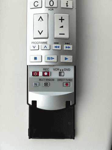
Figure 2: Hidden controls on a TV remote
This question highlights problems with ambiguous or jargon terms, or with other controls that look like a better choice. It also finds problems with actions that are physically difficult to execute, such as when you need to press three keys on the keyboard at the same time (and stand on one leg).
Figure 3 shows an example from a car park machine at Stuttgart airport that has a weak link between the control and the action. I used this machine over a period of 18 months while on assignment in Germany. The first time I arrived at the airport and wanted to leave the car park, I was confronted by the barrier and the control shown in the picture. The barrier has a slot at the top and two buttons, a green one on top and a red one below. I didn't have anything to put in the slot, so I guessed I had to press one of the buttons.

Figure 3: Green for Go or Red for Exit?
Question: Which button would you press to lift the barrier: the green one or the red one?
Convention dictates that you would press the green, upper button. In fact, this appeared to do nothing. Assuming that the barrier was broken, I pressed the red button, thinking that this would put me in intercom contact with the car park attendant who could then open it for me. To my surprise, the red button lifted the barrier.
Clearly, I was not the only person to experience this difficulty. When I returned some weeks later, the design had been upgraded (see Figure 4). As well as a large sign showing the correct button to push, some ‘help text’ had been added to the system (in both German and English) saying ‘Please press the red button’. To emphasise this, the designers had even printed the word ‘red’ in red ink. Which button would you press now?

Figure 4: Not the first time that documentation has been used to rescue bad design.
As if to prove that customers do not read documentation, when I returned some weeks later, the design had been changed again (see Figure 5).
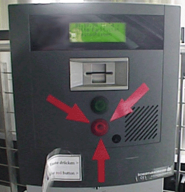
Figure 5: When you're in a hole, stop digging.
Presumably, customers had not been using the help system. The hint text, now flapping in the breeze, had been almost discarded and the design had been changed to include a series of (red) arrows, indicating which button to press.
This month’s rhetorical question: how many participants would have been needed in a usability test to spot this blooper?
This question helps you find problems when feedback is missing, or easy to miss, or too brief, poorly worded, inappropriate or ambiguous. For example, does the system prompt users to take the next step in the task?
Figure 4 shows an example from a control panel for an electronic toilet door on a British train. What button would you press if you want some privacy?
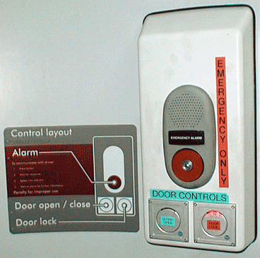
Figure 4: A toilet door control panel that only a trainspotter could love.
With this system, you first need to press the ‘Door open / close’ button and then you need to press the ‘Door lock’ button. If, like many people, you forget to press the ‘Door lock’ button, you may find your privacy interrupted as someone on the other side of the door opens it to reveal you seated on the toilet like a prize in a game show. This problem occurs because the door fails to provide adequate feedback on whether it is locked or unlocked.
The best way to get going with a cognitive walkthrough is to try it yourself. Start off by writing down the happy path for sending a message on your mobile phone. Then walkthrough each step in the process and ask the 4 questions of the interface. If you want to explore the method in more depth, you should attend our training course: Usability expert reviews: Take control of auditing systems for usability.
Find out more on our 3-day, user experience immersion seminar.

Dr. David Travis (@userfocus) has been carrying out ethnographic field research and running product usability tests since 1989. He has published three books on user experience including Think Like a UX Researcher. If you like his articles, you might enjoy his free online user experience course.

Gain hands-on practice in all the key areas of UX while you prepare for the BCS Foundation Certificate in User Experience. More details

This article is tagged expert review, heuristic evaluation.
Our most recent videos
Our most recent articles
Let us help you create great customer experiences.
We run regular training courses in usability and UX.
Join our community of UX professionals who get their user experience training from Userfocus. See our curriculum.
copyright © Userfocus 2021.
Dr. David Travis (@userfocus) has been carrying out ethnographic field research and running product usability tests since 1989. He has published three books on user experience including Think Like a UX Researcher.
Get hands-on practice in all the key areas of UX and prepare for the BCS Foundation Certificate.
We can tailor our user research and design courses to address the specific issues facing your development team.
Users don't always know what they want and their opinions can be unreliable — so we help you get behind your users' behaviour.