UX Certification
Get hands-on practice in all the key areas of UX and prepare for the BCS Foundation Certificate.

We're often told that senior managers don't have the time to read a detailed report describing the findings from a usability test. This means our thoroughly argued, carefully analysed and clearly presented 60-page report could have no effect on improving the product or changing the culture. How can we better engage managers with our data?
There is no point in creating a report that nobody wants to read. And a lengthy report will end up gathering dust in a manager's in-tray or lost for eternity in the bowels of the company's intranet. But just because senior managers aren't interested in a comprehensive report doesn't mean that they are not interested in user experience data. All managers are interested in "Business Intelligence": what you get when you analyse raw data and turn it into knowledge. One good example of this is web analytics. With web analytics we risk being drowned by data, but companies such as Google have devised creative ways to present the data in the form of a dashboard — a short report that delivers business intelligence in graphical form.
When we developed our web usability benchmarking tool — a tool to measure web site usability and directly compare the usability of one web site with another — we knew that collecting the data was only half the battle. We knew that companies don't act on user experience data unless senior management are swayed by the findings. So we set to work devising a way to present the data in a format to help managers engage with the data.
To illustrate our thinking, we'll be presenting data from a topical study we have just carried out, comparing the usability of Valentines Day web florists: bunches.co.uk and interflora.co.uk. We carried out this benchmark study with over 100 participants. Half the participants used the Bunches web site and the other half used the Interflora web site. Each participant carried out 4 tasks, and for each task we measured success rate, time on task and a subjective rating of task difficulty. Participants also commented on the ease or difficulty of the task by writing 1-2 sentences describing their experience. How could we compress these data into a concise graphical summary — a usability dashboard?
A sensible starting point for any usability dashboard report would be the ISO definition of usability. ISO 9241-11 defines usability as the "Extent to which a product can be used by specified users to achieve specified goals with effectiveness, efficiency and satisfaction in a specified context of use." This gives us three areas to focus on: effectiveness, efficiency and satisfaction. Within these areas we want to find emblematic measures: usability measures that are firmly rooted in business objectives. Web analytics guru Avinash Kaushik describes an emblematic measure as a measure that "everyone (from the CEO on down) gets & right away and can understand if it is good or bad".
An obvious emblematic measure for effectiveness is success rate: the number of participants who manage to complete the task successfully. This should certainly resonate with our senior managers since this has clear face validity: if customers can't complete a task, you can't make money from it. We can make the data a bit more informative by including not just the number of successful users but also the number of unsuccessful users and the number of users who abandoned the task. A bar chart becomes the obvious choice for representing these data. Figure 1 shows the results from the usability test of bunches.co.uk.
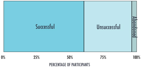
Figure 1: Stacked bar chart showing the number of successful and unsuccessful participants and the number of participants that abandoned the task.
We also need to supply the underlying numbers behind this graph. In this task, the success rate was 60%. But this number on its own isn't sufficient. Along with our estimate of success rate we need to provide an estimate of our confidence in this number — our "margin of error". You can find completion rate calculators on the web. For this study, the 95% upper and lower confidence intervals were 47% and 72% respectively. Our dashboard will need to include these numbers alongside the graph.
There are various ways of measuring efficiency, but again a measure that most senior managers would understand is the time taken to complete a task. Unlike success rate, there will be a wide distribution of task times. Some people will be able to complete the task quickly and others will take longer. So rather than simply present the mean value, we could show the distribution of task times for all the participants. Figure 2 shows the way this looks for our sample study. The bars show the number of participants whose time to complete the task fell within the appropriate "bin". Each bin shows a range of times, so for example, 3 participants completed the task in 126-150 seconds.
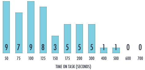
Figure 2: Bar chart showing the distribution of task times in a usability test.
Again, we need to provide the core measure, which is the average time taken to complete the task. Because task times are not normally distributed, you should quote the geometric mean. In this study, the average time on task was 1m 54s, 95% CI (1m 37s, 2m 14s).
Most usability tests include some kind of survey or questionnaire and this lends itself to creating the kinds of chart shown in Figure 3. This chart shows the number of participants that rated the task difficulty as "Hard" through to "Easy". For example, the graph shows that 4 people though the task was "Hard".
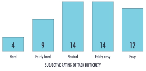
Figure 3: Bar chart showing the distribution of participant ratings.
Again, there needs to be a summary measure indicating the average rating. In this study, the average rating was 60%, 95% CI (51%, 68%).
Survey results are not our only insight into user satisfaction. Another measure of satisfaction that would resonate with senior managers is the ratio of positive to negative comments made by participants. Since some proportion of these will be neutral, a split area chart (see Figure 4) is a logical way to present the data in our dashboard since then the proportion of positive and negative comments can be directly compared.
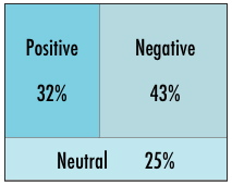
Figure 4: Area chart showing the distribution of positive, negative and neutral participant comments.
In addition to these measures of usability, we also need to include some summary details about the study, such as the number of participants, the task description, representative participant comments and a statistical comparison with the main competitor (Interflora in this example). Adding these items to our report and formatting it to fit on a single page gives us the example shown in Figure 5.
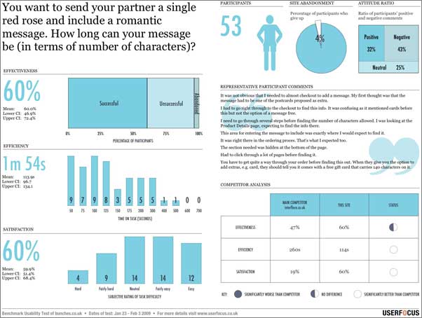
Figure 5: Benchmark report on one page. Download sample report as a pdf document.
With this report format, we show the results for each task on a separate page. Our senior manager now has a lot less paper to shuffle through and at-a-glance can assess the performance of the web site using robust measures of usability.

Dr. David Travis (@userfocus) has been carrying out ethnographic field research and running product usability tests since 1989. He has published three books on user experience including Think Like a UX Researcher. If you like his articles, you might enjoy his free online user experience course.

Gain hands-on practice in all the key areas of UX while you prepare for the BCS Foundation Certificate in User Experience. More details

How should you go about collecting data in usability tests? This article examines the data collection process in usability studies and describes some popular data logging solutions. Data collection for usability research.

This article is tagged ISO 9241, strategy, metrics, selling usability, usability testing.
Our most recent videos
Our most recent articles
Let us help you create great customer experiences.
We run regular training courses in usability and UX.
Join our community of UX professionals who get their user experience training from Userfocus. See our curriculum.
copyright © Userfocus 2021.
Dr. David Travis (@userfocus) has been carrying out ethnographic field research and running product usability tests since 1989. He has published three books on user experience including Think Like a UX Researcher.
Get hands-on practice in all the key areas of UX and prepare for the BCS Foundation Certificate.
We can tailor our user research and design courses to address the specific issues facing your development team.
Users don't always know what they want and their opinions can be unreliable — so we help you get behind your users' behaviour.