
UX Certification
Get hands-on practice in all the key areas of UX and prepare for the BCS Foundation Certificate.

Imagine the scenario. You’re all set to design your new app. You’ve done your research and identified the core set of features that you would like in your product. But your budget allows for developing 25% of these features at best. What do you do? How do you identify the features that your users really want? Enter the Kano Model.
Published in 1984 by Noriaki Kano, professor of Quality Management at the Tokyo University of Science in Japan, the Kano Model proposes a way of predicting customer satisfaction. Simply put, the model claims that all features are not equal – and some are more effective than others.
To discover the most important features, Kano argued, design teams need to uncover each feature’s emotional impact on customers. You achieve this by providing each feature with a grade.
Kano’s model maps individual features onto 5 grades. Each grade indicates how customers perceive a specific feature and the how it relates to customer satisfaction. The five grades are:
After you map your features to the grades, you’ll know which features will have the biggest emotional impact and so you can decide where to allocate your design effort.
Let’s look at each of the grades in turn.
Also called “delighters”, these are the “wow” features, the features that put a smile on your face. These are the differentiators that make an application or device stand out.
Think about the first time you saw a touch-enabled scrolling smartphone or asked Siri for directions to the nearest Chinese restaurant. Those are delighters.
The essence of these features is that customers don’t usually expect them. They are a pleasing surprise that, once experienced, creates a desire to have and to use them but if never seen, they are not missed.
These are the features where a direct, one-dimensional relationship exists between improving the quality of the feature and customer satisfaction.
Consider increased bandwidth, miles-per-gallon and free voice minutes: the “more” of the feature, the greater the customers’ satisfaction.
These are basic features which an application or service must provide, if they are to stand any chance of success. When these features are not available customers will simply look for other options. But unlike 'one-dimensional’ features, improving 'expected’ features does not increase satisfaction.
For example, making a call with a smartphone is a basic, must-have capability. If a new phone continually drops calls, it will disappear from the market.
Another interesting aspect to note is that with time, “attractive” features — that were considered differentiators when they first appeared — can quickly become “must have” features, like a touch screen on a mobile phone.
These are features that customers simply don’t care about. Customer satisfaction is unaffected by their improvement because they are neither good nor bad.
These are particularly important features.
Though rare, these are the features that - when present detract from customer satisfaction. These are features customers don’t want and would prefer them removed from the app or service.
One infamous example is the Microsoft Office assistant Clippit that tended to irritate users with its ceaseless insistence on helping at the stroke of every key.
There are three steps to applying the Kano model.
Just as you would for any usability methodology, your planning, design and testing is relevant to specific user groups. So first, identify your users.
Next, you need to identify which features to test for each group. There is simply no point in trying to test too many features it is time consuming and will exhaust your users. If you need to test a large number of features, consider testing iteratively or in separate groups.
This means that grading and insights, arrived at through the Kano model, are always in the context of the features and the user group tested.
This comprises two steps:
Preparing the questions
The Kano model uses a survey with a very specific form of questionnaire, developed as part of the model, in which users are asked two questions about each tested feature:
This is the heart of the Kano model, and possibly the trickiest to apply, and here’s why: contrary to what you may have been taught as a UX professional, you are asking the user to imagine their feelings in a given state, rather than observing what they do.
A major issue to look out for at this point is the questions. It is very hard to phrase a good survey question so that participants understand it without assistance.
This can result in invalidating the entire effort, so it is very important to test your questions in advance, with users and colleagues, to ensure they are clear.
Getting user feedback
When answering the two questions per feature, users are always required select one of these predefined options:
Note: I have found no “official” guidelines or best practices indicating how many users to test with. Some sources state a minimum of 12 users while other have stated that 5-10 users can provide a good indication of a feature’s grade.Note also that this isn't a repleacement for face-to-face testing. Of course, it is always best to observe actual reactions, for example by providing users with hands-on experience on both included and absent features. This is really about triangulating data.
The accumulated responses are then gathered in the Kano model’s grading map, which correlates the 2 responses into a final grade for each feature:
A Attractive
E Expected
O One dimensional
I Indifferent
R Reverse
Q Questionable (reflecting unclear results which cannot be graded).
The following example shows one user’s response to a single feature, answering “1” on the functional question and “2” on the dysfunctional question, grading this feature as “A”, i.e. “Attractive”.
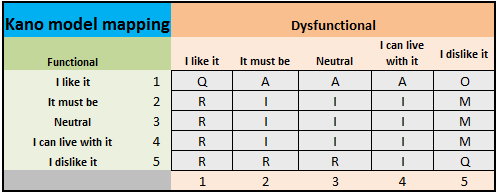
The table shows how you arrive at a final grade from the functional and dysfunctional ratings.
Different users may rate the same feature differently, so the grade with the most responses is this feature’s final grade.
This is where you will do a lot of the tedious, monotonous labor of entering data and accumulating results. To help you with this, we have prepared an Excel tool which requires only entering each user’s response and automatically maps and aggregates responses for a final grade.
This has been an introduction to what we hope you will find to be a useful tool in your work. The web provides many additional resources on applying the Kano model.
But though mapping features is important and useful, it cannot — and is not intended to — replace actual usability testing and iterative design processes.
We cannot predict the future, but we can try and maximize our impact and minimize wasted effort in aiming for the best apps and services we can provide.

Ori Zmora is a User Experience expert with the Experience Design Center (XDC) at Amdocs Ltd, where he designs and consults on a variety of projects, from enterprise software to mobile applications. Ori has been working in the fields of user experience, design and development of digital interfaces and digital advertising since 2001. He holds an HFI CUA certification and is a member of the Israeli Bar Association.

Gain hands-on practice in all the key areas of UX while you prepare for the BCS Foundation Certificate in User Experience. More details

This article is tagged tools.
Our most recent videos
Our most recent articles
Let us help you create great customer experiences.
We run regular training courses in usability and UX.
Join our community of UX professionals who get their user experience training from Userfocus. See our curriculum.
copyright © Userfocus 2021.
Ori Zmora is a User Experience expert with the Experience Design Center (XDC) at Amdocs Ltd, where he designs and consults on a variety of projects, from enterprise software to mobile applications. Ori has been working in the fields of user experience, design and development of digital interfaces and digital advertising since 2001.
Get hands-on practice in all the key areas of UX and prepare for the BCS Foundation Certificate.
We can tailor our user research and design courses to address the specific issues facing your development team.
Users don't always know what they want and their opinions can be unreliable — so we help you get behind your users' behaviour.