
UX Certification
Get hands-on practice in all the key areas of UX and prepare for the BCS Foundation Certificate.

Interaction design is the art of managing a conversation between a user and a computer system. When a user asks for something that the computer can't understand, the computer throws up an error message. An error message is the computer's way of saying, 'Pardon?'
System errors are critical moments in the user experience, just like complaint handling is a defining moment in the customer experience. Deal with the problem well and your customer stays a customer. Deal with the problem poorly and the customer leaves — and, after he or she starts a FaceBook group to discredit you, you may lose lots of future customers too.
In this article, I'll outline 6 principles for dealing with system errors:
Once an error has occurred, you need to ensure the user is aware of the problem. This means the error message should be visible: the user shouldn't have to divine if, or where, an error has occurred.
One of my favourite examples of a (near) invisible error message is this dialogue box from an install program. At first glance, everything seems fine and it would be easy to misread the dialog and assume the drivers had been installed:
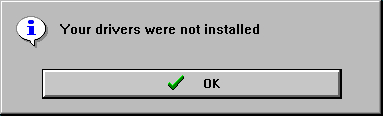
This dialog box from a install program contains a green tick and a large 'OK' button. The design implies that the drivers have been installed, when they haven't.
A good way to test out this principle with a web site is to submit a form with errors or missing 'required' fields and see what happens next. When users make a mistake with a form, you need to make it absolutely clear where the error has occurred. Returning a form that simply lists all of the problems doesn't help users appreciate where the error has occurred and what they need to do to fix it.
To resolve the issues thrown up by the web page in the next example, the user needs to continually scroll back to the top of the page to understand which error message refers to which field. A better design would be to place the error message next to each field that needs to be completed.
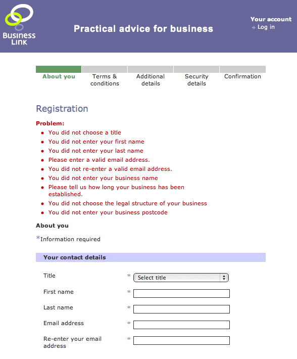
This page appears on the Business Link web site when you want to register but don't complete all the fields. A long list of errors appears at the top of the form, and although the error message itself is helpful ('You did not choose a title'), it's not clear which issue relates to which part of the form.
A second key principle is that good error messages should be precise and specific. Error messages need to say what has happened, why it's a problem, and how it can be resolved. An error message that simply states, 'an error has occurred' is no use to anyone.
I came across this example when my trial version of Symantec's antivirus software was coming to an end and I wanted to buy a license. I clicked a link in the application and arrived at this page on their web site:
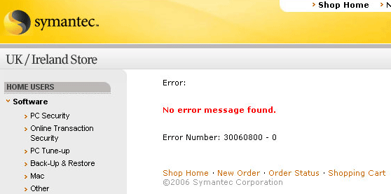
This error page from the Symantec web site contains the text 'Error: No error message found', along with a 9-digit error code. After this, I decided to choose a different supplier for my antivirus software.
But there are limits to how precise and specific you need to be. Remember, it's just an error: the user needs enough information to understand the issue and move on. don't take this as an opportunity to subject the user to a training course in the use of your program. The example below from WinSCP (a Windows FTP program) provides too much background on the error:

This warning dialog from WinSCP comprises 8 sentences and nearly 150 words. The text itself is also poorly written and ungrammatical. Its only saving grace is the 'Never ask me again' checkbox.
Nobody likes being stuck. Users encounter errors on the way to achieving goals, so your error message needs to give users the assistance they need to resolve the problem and move on.
This error message popped up when I was using a Canon printer:
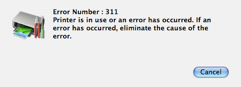
This error message begins with an error number (always a bad sign). The message itself — 'Printer is in use or an error has occurred. If an error has occurred, eliminate the cause of the error' — provides no constructive help.
Simply asking the user to 'eliminate the cause of the error' is inadequate. The user needs to know exactly what has gone wrong and what he or she should do to fix it. (And don't get me started on heading up the message with an error number. Although error numbers can be a useful way for advanced users to troubleshoot a problem, they shouldn't be the first thing that users are asked to read).
A related issue occurs in an error message that a colleague came across when installing an Apple backup disk on his home network. The consequences of choosing each option is unclear from this dialogue. What is the penalty of ignoring the status light flashing amber? Should the user 'skip' or 'ignore' this error?
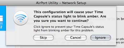
Even Apple struggle with error messages. The text in this message reads: 'This configuration will cause your Time Capsule's light to blink amber'. So what? A good error message should provide more constructive help.
It may not seem like an error message at first, but a 'no results found' response to a search enquiry is indeed an error message. The image below shows an example from the BBC web site. In this example, I've searched for 'veterinary' but spelt it wrongly; the 'error message' simply tells me that there are no matching results. But this isn't very constructive: it's not clear what I should do next:
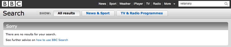
Searching for 'vetanary' on the BBC web site gives no results but the error message provides no suggestions on what to do next.
A better design would be to provide suggestions on what the user could do next, offer a 'did you mean' suggestion, or even (as shown in this better example from Google) automatically correct the search term:
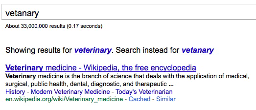
The same search on Google corrects the spelling.
I'll admit it: writing good error messages is hardly the most exciting part of system design. Because of this, the precise wording of error messages tends to be left until the last moment and is often left to the person who writes code, rather than the person who writes content. This might be the reason why they are often so poorly phrased. Error messages often appear written from the system's perspective rather than from the user's perspective.
This example below comes from Yelp. When creating a Yelp profile I've included a number in the last name field. The system doesn't want me to have a number in the last name. Ideally it should let me put whatever I want in my name, but putting that issue to one side for the moment, a simple way to communicate this error is to say: 'You can't have numbers in your name'. Instead the error message reads 'Character 2 at position 6 is not allowed.'
Curiously, the offending number is actually in position 7. However, this error has been written by a developer — and if you're a developer, you start counting from zero, not from one.
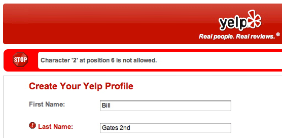
An error message that only a programmer could love.
Designers would be wise to follow Alexander Pope's aphorism, 'To err is human; to forgive, divine.' The test of a user centred error message is how well it succeeds in helping the user save face after an error has occurred. A user's instinctive reaction to an error message is, "Aargh! I did something wrong!" Like a polite butler, the system should respond, "Oh no sir… that was my mistake." Nobody wants to feel stupid when using your system. So check that error messages are written in a non-derisory tone, do not blame the user and avoid phrases like 'user error' at all costs.
The example below comes from an earlier version of the Abbey National online banking web site (before the bank became Santander). As with many of the other examples in this article, this particular error message has a number of problems: for example, it doesn't help me resolve the issue (other than providing a helpdesk number) and it uses an error code rather than a precise description of the error. But my reason for including it in this section is because it does such a good job of making me feel stupid. Why is the word 'error' presented in such a large font? (Presumably so the fraudster shoulder surfing my online banking session can realise I'm totally clueless and ripe for the taking).
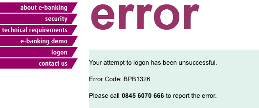
This error message appeared at an online banking site after a problem signing in. It contains the word 'error' in a massive font implying that the user has made a mistake (when in fact this was a system problem).
Another example with which we're all familiar is the '404-page not found' error that appears when you follow a broken link. Like many of the other examples I'm showing, the following example contains more than one problem — but my reason for highlighting it here is because of the opening phrase: 'you did something wrong'. Hold on: I clicked on a link in your web site and got this page. don't tell me this is my mistake.
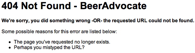
The day I broke the Interweb.
As well as deflecting blame from the user, a good '404' page should make suggestions on what users should do next to reach the page they are after, include a search box, and perhaps include links to the most popular pages in the site.
Stupid error messages are error messages that are self-contradictory or that otherwise contain errors of their own. Perhaps the most famous example is the classic 'Press F1 to continue' when a PC is started without a keyboard:
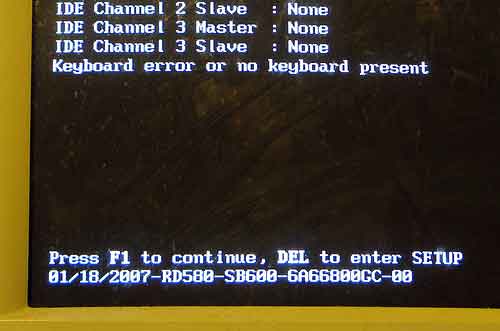
The error message reads, 'Keyboard error or no keyboard present. Press F1 to continue, DEL to enter SETUP'. Photograph by Brent Nashville on flickr. Some rights reserved.
Similarly, you need to ensure that your error messages are free of spelling errors or typos. An error message with a spelling error is the very pinnacle of idiocy. It's like trying to correct someone's grammar and getting it wrong.
The example below shows a screenshot from a car park payment machine. Note the typing error. (Again, this isn't the only problem with this error message: it seems to imply the user has made the error with its 'card is illegible' statement):
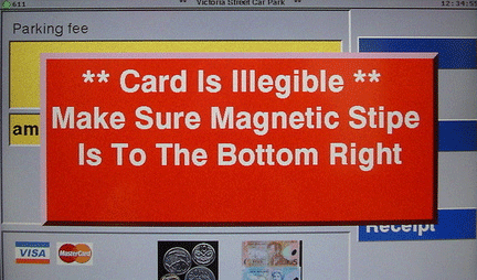
The text on the error message contains a typing error ('stipe' for 'stripe'). Photograph by Justine Sanderson (Titne) on flickr. Some rights reserved.
Similarly, the error message below includes HTML formatting that simply makes the error message very hard to read.
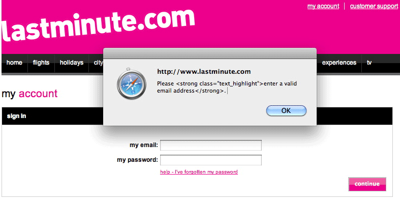
This pop-up message from the lastminute.com web site leaks html formatting commands into the error message itself.
To review the 6 principles again:
Nobody likes to see an error message. But follow these principles and you'll remove some of the misery from the experience.

Dr. David Travis (@userfocus) has been carrying out ethnographic field research and running product usability tests since 1989. He has published three books on user experience including Think Like a UX Researcher. If you like his articles, you might enjoy his free online user experience course.

Gain hands-on practice in all the key areas of UX while you prepare for the BCS Foundation Certificate in User Experience. More details

This article is tagged guidelines.
Our most recent videos
Our most recent articles
Let us help you create great customer experiences.
We run regular training courses in usability and UX.
Join our community of UX professionals who get their user experience training from Userfocus. See our curriculum.
copyright © Userfocus 2021.
Dr. David Travis (@userfocus) has been carrying out ethnographic field research and running product usability tests since 1989. He has published three books on user experience including Think Like a UX Researcher.
Get hands-on practice in all the key areas of UX and prepare for the BCS Foundation Certificate.
We can tailor our user research and design courses to address the specific issues facing your development team.
Users don't always know what they want and their opinions can be unreliable — so we help you get behind your users' behaviour.