UX Certification
Get hands-on practice in all the key areas of UX and prepare for the BCS Foundation Certificate.

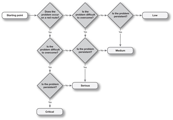
A typical usability test may return over 100 usability issues. How can you prioritise the issues so that the development team know which ones are the most serious? By asking just 3 questions of any usability problem, we are able to classify its severity as low, medium, serious or critical.
Running a usability test has been compared with taking a drink from a fire hydrant: you get swamped with data in the form of usability issues that need to be organised, prioritised and (hopefully) fixed. Although it's tempting to use your own judgement in determining severity, this causes a difficulty when a developer challenges your decision: "How did you make that issue critical? I think it's more of a medium problem".
Having a standard process for defining severity means that you can be consistent in the way you assign severity and means that you provide the transparency needed for people to check your work.
In fact, by asking just 3 questions, we can classify any usability problem.
Red routes — frequent or critical tasks — are the most important tasks that the system needs to support, by definition. For example, if the "on-off" button on your newly designed gadget is hard to operate, all of your users will be affected. Because problems on red routes affect more users, they are more severe.
Some usability problems are show-stoppers: users just can't proceed. For example, if an important control is hidden in a dialogue box or behind a right click, the functionality may as well not exist for some users. Other usability problems are easy to workaround. Hard to solve problems are more severe because they have a bigger impact on completion rate.
Persistent problems — problems that keep cropping up — are more severe because they have a bigger impact on time on task and on customer satisfaction. An example of a persistent problem is a web site that doesn't have underlined hyperlinks. This means users can find the links only by "minesweeping" over the page. This problem is persistent, because even when users know the solution to the problem they still have to experience it. Note that "persistent" means that the problem occurs repeatedly, throughout the interface — users come across the problem on multiple screens or pages.
We can put these three questions in a process diagram and use it to define four severity levels.

Download this decision tree as a pdf
If you currently prioritise usability problems using 'gut feel' or intuition, you run the risk of being exposed as a fraud by a developer or manager who asks you to justify your priority ranking. Instead, deliver more robust findings by using this decision tree.

Dr. David Travis (@userfocus on Twitter) is a User Experience Strategist. He has worked in the fields of human factors, usability and user experience since 1989 and has published two books on usability. David helps both large firms and start ups connect with their customers and bring business ideas to market. If you like his articles, why not join the thousands of other people taking his free online user experience course?

Gain hands-on practice in all the key areas of UX while you prepare for the BCS Foundation Certificate in User Experience. More details

Two measures commonly taken in a usability test — success rate and time on task — are the critical numbers you need to prove the benefits of almost any potential design change. These values can be re-expressed in the language that managers understand: the expected financial benefit. Two measures that will justify any design change.

This article is tagged expert review, heuristic evaluation, metrics, usability testing.
Our most recent videos
Our most recent articles
Let us help you create great customer experiences.
We run regular training courses in usability and UX.
Join our community of UX professionals who get their user experience training from Userfocus. See our curriculum.
copyright © Userfocus 2021.
Get hands-on practice in all the key areas of UX and prepare for the BCS Foundation Certificate.
We can tailor our user research and design courses to address the specific issues facing your development team.
Users don't always know what they want and their opinions can be unreliable — so we help you get behind your users' behaviour.