
UX Certification
Get hands-on practice in all the key areas of UX and prepare for the BCS Foundation Certificate.

Failing to speak the user's language is an easy trap to fall into because you may not know the user's vocabulary and because technical terms often become second nature to the design team. As with much of user centred design, the secret lies in getting closer to your users so you can empathise with them.
Most weeks you'll find me carrying out usability reviews for clients. Sometimes these are usability inspections and sometimes these are usability tests, but there's a usability error I come across in virtually every system I examine. What makes this problem doubly unusual is that when I raise the problem with the design team they have a complete blind spot about the issue — sometimes even denying that the problem exists.
Many designers still believe that their users are like them. The truth is, that's rarely the case. A recent review of usability test results showed that many "ordinary" users struggle with interactions that most designers take for granted. Interactions like long drop down lists (such as country selectors), where many users don't know they can type the first letter to jump to a selection; clicking on a logo to get back to the home page of a web site; and using drag and drop interactions on a web page.
It's this lack of empathy that makes a failure to speak the user's language such an insidious problem to spot in your own interface.
For example, let's say we wanted to direct people to an area of a form that has a set of radio buttons. We could just tell people to "choose one of the radio buttons", right? Everyone knows what a radio button looks like. Cedric Savarese ran a survey where he asked people to name various user interface controls (like a drop down menu, a list box and a radio button). In a surprising result, when shown a radio button he found that more people described this control as a checkbox than as a radio button.
Here's some examples of the way this problem manifests itself and some suggestions on how to fix it.
Just because words like "auto-complete" and "geotagging" now appear in the Oxford English Dictionary, that doesn't mean you're free to use them in your interface. Technical jargon should be avoided in your system unless you know that your user will be familiar with it.
Here's an example of this problem taken from the Orange web site.
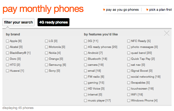
Figure 1: This screenshot from the Orange web site shows 4 columns of checkboxes. Two of the columns contain lists of mobile phone features that are riddled with jargon.
This dialog is a filter that allows you to find the phone you're searching for by choosing various checkboxes. The "brand" filter on the list probably won't cause a problem for most people, but take a look at the "features you'd like" list on the right. Some features (like 'camera' and 'FM radio') are described in words that everyone would be familiar with. But, outside of the telecommunications or tech industry, who really knows what "NFC ready", "Quick Tap Pay" and "Swapables" means?
There's an old rule in marketing that says you don't tell people about features, you tell them about benefits. That's a good slogan to remember. Look at the words in your user interface and question whether they express benefits or features. If you want to find out the words that your users would use for a feature, describe the feature to them (for example, via a survey) and ask what words they would use to summarise it. For example: "This technology allows you to make payments by bringing your phone close to a cash register. What would you call it?: 'Contactless payment'? Or 'NFC ready'?" I think we know the answer to that one.
A while back I came across this prize-winningly bad example of information architecture at a web site that makes watches.
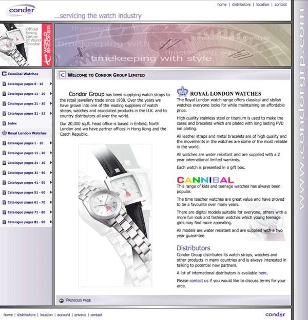
Figure 2: The homepage of a web site that sells watches.
If we zoom in on the navigation in the left-hand menu, you'll notice that the web site is organised around a paper catalogue. If you don't have the catalogue, the site is impossible to navigate.
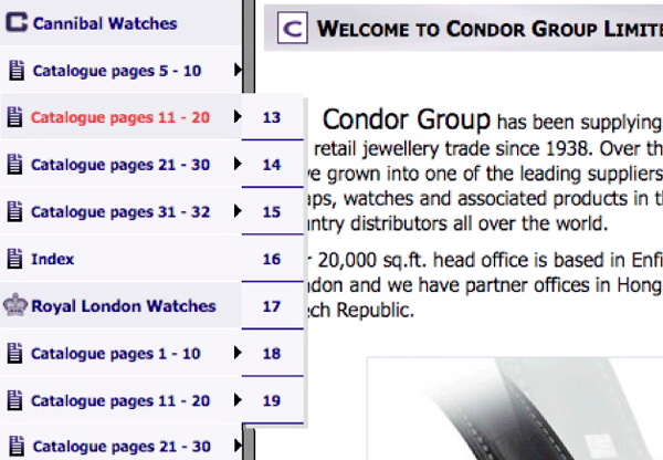
Figure 3: This screenshot shows a zoomed in version of the left hand navigation of the web site in Figure 2. The left hand navigation links use terms like "Catalogue pages 5-10" and "Catalogue pages 11-20".
This example is extreme, but it's still the case that many web sites are organised around the way the organisation thinks of the world rather than the way users think of the world.
Intranets are frequently a source of poor examples, presumably because the level of jargon in-breeding is so high. I once reviewed a client's intranet that had these three choices at the same level of the information hierarchy: "Salary", "Your Salary" and "Pay Information". Presumably, these are three very different concepts if you work in HR. But if you're a regular employee looking to find out your salary band, which of these options would you pick?
One of the best tools we have for improving your information architecture is a card sort. With a card sort, you provide your users with a list of the main sections of your web site and ask them to organise the cards into groups that make sense. Users can also annotate the cards to identify words that they don't understand and provide additional terms with which they're more familiar.
Radio buttons, checkboxes, submit buttons, scroll bars, hyperlinks' These are the fundamental components of a user interface. When users see these standard controls in a user interface, they usually know what to do with them (even if they don't always know what they're called). But in a misguided attempt to stand out from the crowd, some designers choose to create buttons and controls that look different. I once asked a designer why he chose to do this, and his reply was that the standard user interface controls are "boring".
It's as if he just sat in my car and said, "Your car is so boring! Look, it has a standard steering wheel and gas pedal! What you need is a joystick!"
There are some things that just work better when you follow the standard, and user interface controls are one of them. Depart from the standard controls and the "driveability" of your user interface will suffer.
The trite answer is to use the standard interface controls that come with your user interface builder, such as HTML5. A more nuanced answer is: create a style guide for developers that contains examples of the standard controls along with code snippets and a description of how they are used in your user interface. If you create this in the form of a wiki, the style guide can be easily updated and it can contain discussion threads explaining why these particular controls are used the way they are.
Metaphors are a great way to help new users grasp the conceptual model behind your user interface design. For example, early car designs looked like a "horse and cart" which helped people new to motoring to understand the fundamental concept.

Figure 4: Replica of the Benz Patent Motorwagen from 1886. Foto by Softeis, from Wikipedia.
But metaphors can also mislead people. If you open iBooks on an iPad, you're presented with a double-page spread of your book, and you simply swipe the page to turn to the next page. If you open the Contacts application on the iPad, you're presented with a very similar rendering, but now swiping the page doesn't work. The Apple designers used a book metaphor for the Contacts app, but failed to follow through.
Good metaphors are built upon a solid understanding of the user's mental model: the user's "folk theory" of the way the system or work domain operates. (Confusingly, Indi Young uses the same term for something quite different. My use of the term is consistent with its use in cognitive psychology).
To get this understanding, you need to spend time with your users: do site visits and understand their goals, motivations and day-to-day tasks. Ask your users for stories; ask them how they think the system works.
One of my favourite examples of this was described by William Kempton in 1986. Kempton asked people how they thought a heating thermostat worked. He found the world was divided into two kinds of people: those who think of it as like a gas pedal ("The further I turn it, the quicker it will warm up") and those who think of it as a feedback loop ("I'll set it to 21-degrees and it'll stop once it gets there"). The first group of people turn the dial to its maximum setting, the second group choose a specific temperature. Both groups have their own mental model of the way the heating system works but the people with the gas pedal model waste energy and end up getting too hot.
Speaking geekish, rather than English, is an easy mistake to fall into. In our day jobs, we are exposed to specialised language, business models, novel user interface concepts and three-letter abbreviations that rapidly become a new tech lingua franca. And once we've been in the organisation for a few months, what may have puzzled us at first quickly becomes part of our day-to-day vocabulary. As a consequence, it's easy for these terms, models and concepts to leak into the user interface. Try some of the techniques in this article to find issues in your user interface and fix them.

Dr. David Travis (@userfocus) has been carrying out ethnographic field research and running product usability tests since 1989. He has published three books on user experience including Think Like a UX Researcher. If you like his articles, you might enjoy his free online user experience course.

Gain hands-on practice in all the key areas of UX while you prepare for the BCS Foundation Certificate in User Experience. More details

This article is tagged expert review, ia, style guide, usability testing.
Our most recent videos
Our most recent articles
Let us help you create great customer experiences.
We run regular training courses in usability and UX.
Join our community of UX professionals who get their user experience training from Userfocus. See our curriculum.
copyright © Userfocus 2021.
Dr. David Travis (@userfocus) has been carrying out ethnographic field research and running product usability tests since 1989. He has published three books on user experience including Think Like a UX Researcher.
Get hands-on practice in all the key areas of UX and prepare for the BCS Foundation Certificate.
We can tailor our user research and design courses to address the specific issues facing your development team.
Users don't always know what they want and their opinions can be unreliable — so we help you get behind your users' behaviour.