
UX Certification
Get hands-on practice in all the key areas of UX and prepare for the BCS Foundation Certificate.

Within the field of user experience, visual design is sometimes perceived as a bit of an outsider. Indeed, some visual designers are apparently feeling a pressure to rebrand themselves as “user experience” designers to progress their careers. In my experience with clients, visual design is often likened to decorating the walls of your living room. It makes everything a little nicer, but it’s hardly a key part of the architecture of your house.
In fact, visual design has an important impact on the usability of designs. Research shows that people believe that more attractive designs are easier to use than less attractive designs — even when they’re not. This is known in psychology as the aesthetic usability effect and in folklore more simply as, “first impressions count”.
But good visual design offers more than improving people’s attitudes to a design. Good visual design will actually make interfaces easier to use.
There are at least four key principles of visual design that have an important impact on usability. These four principles — contrast, repetition, alignment and proximity — were originally given the engaging acronym CRAP by Robin Williams (the visual designer, not the comedian). You can exploit these four principles to make user interfaces both more attractive and easier to use.
Let’s look at each one in turn.
Contrast in visual design helps to direct the viewer’s eyes to what’s important and helps them focus on what to do next. This means making your call to action — or whatever the focus of attention is meant to be on the page — very different from the other items that surround it.
In this example (Figure 1), the “Add to Basket” button is formatted identically to the “Cancel” button. This means that the user will have to carefully read the text on each button before making a choice.
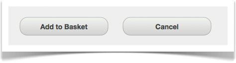
Figure 1: Two buttons on a form, one labeled “Add to Basket” and the other labeled “Cancel”. Because the two buttons are formatted identically, it’s not self-evident which is the primary and which is the secondary action.
With good use of contrast, we can make the default choice immediately apparent to users. For example, we can:
Figure 2 shows the impact of making these changes and with each change it becomes more self-evident which choice we expect the user to make.
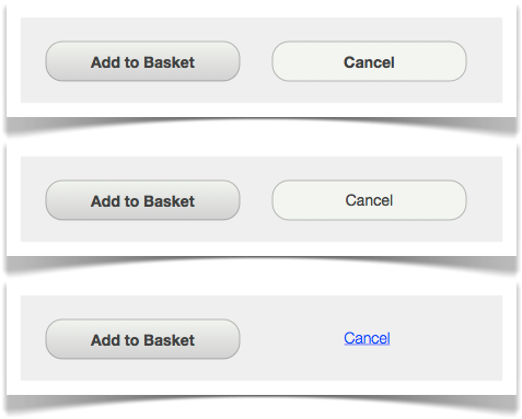
Figure 2: Three examples of using contrast to distinguish the primary action from the secondary action.The first example removed the apparent depth of the “Cancel” button; the second example builds on this and changes the font; and in the third example, the button is replaced with a hyperlink.
This example shows that you have many simple ways of creating contrast in your user interface, even if you think your design skills are limited. Simple text changes like bold, italic, underlining, uppercase, colour and highlighting may often be sufficient (although you obviously need to use these in moderation).
Contrast can also be used for more nefarious purposes. Figure 3 shows a voting paper used during the Anschluss (the 1938 annexation of Austria into Greater Germany by the Nazis). Note how the designer of this ballot paper has used contrast to make the ‘default’ choice (“Ja”) easier for voters to identify. (Officially, 99.73% of people voted ‘Yes’ in this ballot.)
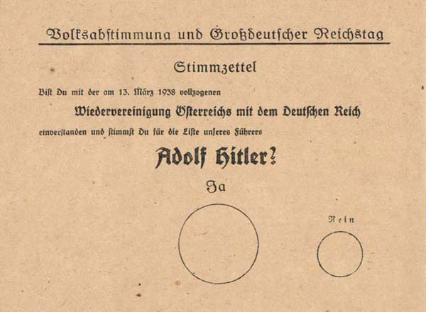
Figure 3: Voting paper from 10 April 1938. The text reads “Do you agree with the reunification of Austria with the German Empire that was enacted on 13 March 1938, and do you vote for the party of our leader Adolf Hitler?” The large circle is labeled “Yes” and the small circle is labeled “No”. From Wikipedia.
Repetition is really about consistency. (Sadly, 'Consistency' doesn't make a memorable acronym when combined with the other principles, so we're making do with 'Repetition' instead). At one level, this principle simply states that systems are more usable (and easier to learn) when similar stuff is presented in similar ways. Note that this means both internal consistency (within your application) and external consistency (with the platform you're designing for). For a web site, internal consistency means making sure you use the same kind of fonts, icons, headings, links, list styles and page layout. External consistency means things like using standard buttons, link colours and search results. Jakob Nielsen has even coined a 'Law' for this: "Users spend most of their time on other web sites." People's expectations are formed by what they experience on other sites so if you do it differently your site will be harder to use. So ensure that people can find the common elements of a web page (such as page titles, site navigation, page navigation, search etc.) in the standard locations.
One of the best ways to use this principle intelligently is to think about the task your users are carrying out. Consider this example: if I asked you to put away the knives, forks and spoons in my kitchen, you would look for the cutlery tray. But if I then asked you to put away a penknife, you would probably look for the overstuffed drawer that contains items like the corkscrew and the tin opener. And if I then asked you to put away a box cutter, you would probably place it in the garage with the hammer, screwdrivers and other tools. This seems inconsistent: they are all knives, so why put them in different locations?
There’s a deeper reason why consistency matters in user interface design and this example illustrates it. Your behaviour in these examples is entirely consistent with the task that you use these objects for. A knife is more like a fork than a box knife when the task is eating; but it is more like a hammer when the task is DIY. The task is the common denominator.
So when thinking about how to apply repetition in your user interface, think about the tasks that users carry out and how you can support that with your visual design.
Alignment simply means making sure that all elements of the design line up horizontally and vertically. This can best be achieved by designing the interface to an underlying grid.
Alignment is probably the most dramatic visual treatment you can do to a design to make it appear visually easier to use. Take a look at Figure 4, below. Without thinking about it too hard, which form looks easier to complete, the one on the left or the one on the right?
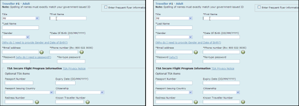
Figure 4: Two identical forms that differ only in their use of alignment.
Most people say the form on the right looks easier to complete. The two forms are identical except that the form fields have been properly aligned in the example on the right. In Figure 5, I have overlaid each form with red lines to show the various alignment lines. You can see that the form on the left, which most people describe as looking more complicated, also has more vertical alignment lines.
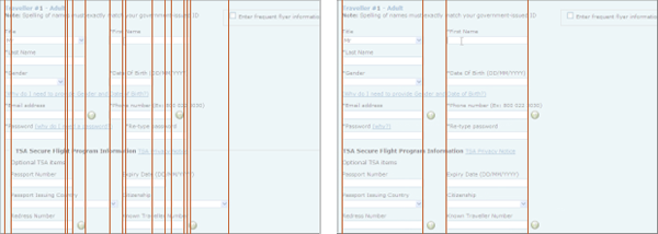
Figure 5: This shows the same forms as in Figure 4 but now the red lines show the vertical alignment points of the various user interface elements. The form on the left (which most people describe as looking more complicated) also has more lines of vertical alignment.
As well as making interfaces look more complicated, poor alignment can also lead to usability mistakes. One of the most dramatic examples comes from a voting paper used in Florida in the 2000 US Presidential election. This ballot paper is called a ‘butterfly’ ballot because the paper has names down both sides, with a single column of punch holes in the centre. Alignment issues caused many people to vote for the wrong candidate.
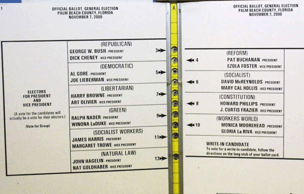
Figure 6: The ballot paper from the US Presidential election in Florida in 2000. Although the Democrats are listed second in the column on the left, voters need to select the third hole on the ballot to vote for them. Voters that select the second hole cast their vote for the Reform party. From Wikipedia.
The principle of proximity was first articulated by the Gestalt school of psychology. The Gestalt theorists emphasised visual perception was about perceiving organised wholes, not just about seeing isolated objects. The principle of proximity means that if you place elements in a user interface near each other, people will think that they are related somehow. There are two ways that you can use this principle to enhance usability. First, proximity will help users find the option they are looking for. If users want to see your range of laptops, it will be quicker for them to find this if it’s grouped with other related items in a part of the interface devoted to “Computers & Office” than if it’s & one of many options in a disorganised mess on the page (see Figure 7).
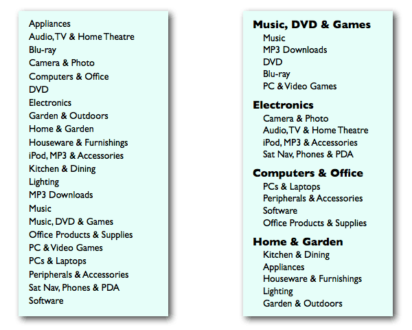
Figure 7: A simple example showing the principle of proximity used to organise items in a navigation menu. The items on the left are in alphabetical order, whereas the ones on the right are organised into groups with each group given a heading.
You can apply this principle in a user interface by appropriate use of background colours, borders and white space: these will help users identify a set of items as a discrete functional block.
But there's a second reason why this principle makes user interfaces more usable: the way you organise information on the page helps people build a conceptual model of how the interface is structured. The web design trend of using “portlets” (as on the BBC’s home page) is a good example of this.
It’s tempting to dismiss visual design as mere icing or eye candy. And certainly, you will never rescue an awful interface simply by making it more attractive. (“You can put lipstick on a pig,” as the old saying goes, “but it’s still a pig”). But its wrong to think of good visual design as doing nothing more than encouraging first use. Following CRAP design principles actually makes systems more usable.

Dr. David Travis (@userfocus) has been carrying out ethnographic field research and running product usability tests since 1989. He has published three books on user experience including Think Like a UX Researcher. If you like his articles, you might enjoy his free online user experience course.

Gain hands-on practice in all the key areas of UX while you prepare for the BCS Foundation Certificate in User Experience. More details

This article is tagged guidelines.
Our most recent videos
Our most recent articles
Let us help you create great customer experiences.
We run regular training courses in usability and UX.
Join our community of UX professionals who get their user experience training from Userfocus. See our curriculum.
copyright © Userfocus 2021.
Dr. David Travis (@userfocus) has been carrying out ethnographic field research and running product usability tests since 1989. He has published three books on user experience including Think Like a UX Researcher.
Get hands-on practice in all the key areas of UX and prepare for the BCS Foundation Certificate.
We can tailor our user research and design courses to address the specific issues facing your development team.
Users don't always know what they want and their opinions can be unreliable — so we help you get behind your users' behaviour.