
UX Certification
Get hands-on practice in all the key areas of UX and prepare for the BCS Foundation Certificate.

Car park payment machines provide an every-day example of poor usability. They teach us that technology should not drive design, that less important tasks should not dominate the user interface and that usability is more than visual design. They also teach us that usability doesn’t always matter in design, the best user interface is no interface and that usability is a differentiator only when customers have a choice.
Here’s a disadvantage of working in the field of user experience that nobody warns you about: you tend to feel continually irritable.
On most days I’ll come across a poorly designed product that frustrates or annoys me. Normal people blame themselves, struggle with the product and move on, but if you’re like me you’ll analyse the design to understand why you struggled.
Were the controls hard to find? Was the sequencing of actions illogical? Was the feedback poor?
When I review the league table of products that irritate me (yes, I have a league table), top place is taken by car park payment machines. It’s as if the revolution in usability that has taken place in other fields has by-passed the world of car park payment machines.
Car park payment machines pose an interesting design challenge. First, designing a machine that people can use first time, without training, is no easy task. Second, they have no consistent user interface pattern: visit 5 different car parks and you’ll find 5 different user interfaces. And third, there’s little in the way of help: there is no attendant to whom you can turn.
So let’s turn this irritation to some good and see what we can learn from these designs.
We’ve known for some time that machines work best when their design takes into account the limitations of people, rather than making people fit the machine. But this fundamental rule of human factors is frequently flouted in the design of car park payment machines.
Here’s an example that I came across at a railway station. It’s worth taking a quick look at the photograph and answering the question: how would you pay for parking, given you have a ticket you collected when you arrived earlier in the day?
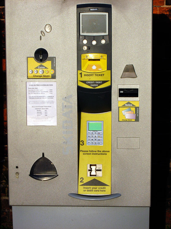
How would you use this machine to pay for parking?
The first time I used this machine to pay for parking I struggled. The “Insert ticket” label has an arrow pointing below, but it turns out that the ticket I was given on entry needs to go in the slot above the label.
A more serious problem was that I wasn’t sure how to pay. As I looked down the machine, I noted the keypad but couldn’t work out where I should put my payment card. This is a tall machine (about 6’) and I was looking above the keypad for the card slot, when I should have looked below it.
It was then I noticed the numbers on the machine: it’s as easy as 1-3-2.
Note to designers: if you have a series of steps, place them in order.
This to me looks like a technical constraint. For whatever reason, the machine needed the credit card slot to be placed below the keypad. That created a user interface where the steps were out of sequence.
This second example comes from a car park payment machine in Buxton in Derbyshire. It’s the kind of machine where you have to enter you car’s license plate when you buy your ticket, so you can’t pass your ticket to someone else if you leave the car park early.
Buxton has an elderly population and when I first saw this machine there was a gaggle of pensioners (if “gaggle” is the correct collective noun for pensioners) trying to work out how to use it.
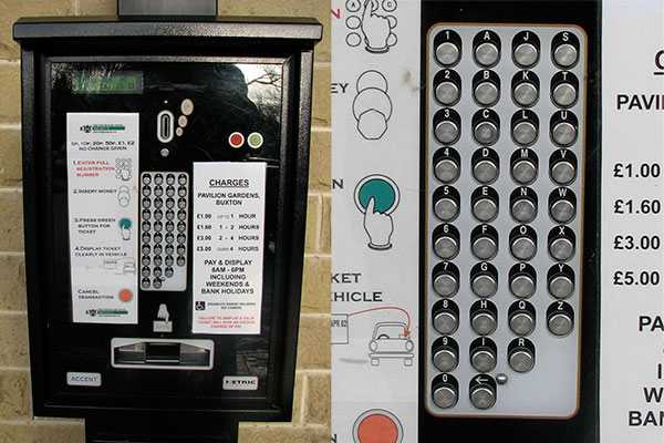
The car park payment machine re-invents the keyboard.
Anyone who has got this far will have enough design sense to spot a number of issues with this design. The first problem is the vertical keyboard — perhaps another example of a technology constraint. (Less charitably, maybe the designers wanted to maximise the space on the machine for instructions as they knew it would be so hard to use.)
The second problem is that it’s a non-QWERTY keyboard, arranged in 4 columns. To give you some idea why this is a problem, stop for a second and try using the keypad to enter your license plate or (if you don’t have a car) your initials and year of birth. This is a problem because people in Buxton (as in the rest of Britain) tend to read left to right. With this design, you first read a digit and then three letters (“1-A-J-S, 2-B-K-T'”) which makes it difficult to find the key you are after. The third problem is that the labels on the keys are closer to the button above the label rather than the button they apply to, so it’s easy to miskey your registration number.
But I think the main problem with this design is that the user interface is designed around the secondary task of entering your license plate. The key task is to pay for car parking. The secondary task is to enter your registration number. But it’s the secondary task that dominates this design.
It’s no wonder that pensioners struggle.
This photograph of a car park payment machine was sent to me by Darren Boocker. The first thing that strikes you is the use of colour and large, friendly looking buttons. It looks like someone has thought about using visual design to solve some of the problems we’ve discussed above.
But stop for a second and do this task: You’ve just parked your car and need to pay for parking. How would you go about it?
A user interface that only an engineer could love. Photograph © Darren Boocker.
Let me put you out of your misery. Here are the instructions for use:
I’m sure this design looked good in the sales meeting. “Those coloured buttons make it so easy to use!” claimed the sales person (so long as you don’t mix them up with the buttons on the payment keypad of course). In fact, this design illustrates the point that applying colour can actually decrease usability if it is not done well.
By the way, those instructions at the top: yes, they are as confusing as they look. Instructions need to be designed too. Imagine a motorist, in the rain, fumbling for coins, in a rush for an appointment, with a queue of people behind, attempting to decode those steps.
There’s an old saying in usability: you can put lipstick on a pig, but it’s still a pig.
This is a pig.
I found that a difficult sub-title to write, but it’s true: sometimes usability doesn’t matter. Think of it from the perspective of the owners of the car park. How does a more usable car park payment machine help them meet their business goals, which is to maximise revenue per parking space?
The answer, of course, is that it doesn’t. Here’s why.
If people use the machine incorrectly, there are two possible outcomes. Either customers overpay for parking, in which case the owners of the car park make more money. Or customers underpay for parking, in which case the owners of the car park raise a fine and make even more money. In either case, the owner of the car park makes more money. It’s like a dark pattern in the same way that the pricing structure of these ticket machines is designed to lead to overpayment.
With most systems, the supplier has additional support costs, such as call centres and help lines. But car park payment machines are different (remember, they bypassed the usability revolution). If you can’t use the machine, there’s no-one you can call upon for help. You just have to resolve the issue on your own.
So the sad truth is that, in this case, improved usability acts against stakeholder interests.
I’m not always irritable. A few months back, I used a car park and smiled. I was travelling from Manchester Airport and I prepaid for parking via Manchester Airport’s web site. Or arrival, I drove up to the barrier and the barrier lifted, as if by magic (the machine had read my license plate and let me park). It let me out in the same way on departure.
It was as if it knew me.
So car park payment machines teach us that the best user interface is no interface.
So why the difference?
Airport car parking is competitive, with many choices. In situations like that, usability becomes a differentiator. The easier it is to pay for parking, the more likely you are to use one car park over another. And that teaches us another important rule:
Car park payment machines teach us that usability is a differentiator only when customers have a choice.
Although that applies to many services these days, there are a few exceptions. So sadly, I expect to remain irritable for many years to come.
By the way, if you think car park payment machines are frustrating, let me show you how Stuttgart airport made a car park exit barrier hard to use.

Dr. David Travis (@userfocus) has been carrying out ethnographic field research and running product usability tests since 1989. He has published three books on user experience including Think Like a UX Researcher. If you like his articles, you might enjoy his free online user experience course.

Gain hands-on practice in all the key areas of UX while you prepare for the BCS Foundation Certificate in User Experience. More details

This article is tagged benefits.
Our most recent videos
Our most recent articles
Let us help you create great customer experiences.
We run regular training courses in usability and UX.
Join our community of UX professionals who get their user experience training from Userfocus. See our curriculum.
copyright © Userfocus 2021.
Dr. David Travis (@userfocus) has been carrying out ethnographic field research and running product usability tests since 1989. He has published three books on user experience including Think Like a UX Researcher.
Get hands-on practice in all the key areas of UX and prepare for the BCS Foundation Certificate.
We can tailor our user research and design courses to address the specific issues facing your development team.
Users don't always know what they want and their opinions can be unreliable — so we help you get behind your users' behaviour.